FPPlD Newsletter

With a decrease in library popularity, it has become increasingly important for libraries to improve their marketing techniques. A library’s newsletter should aim to inform all residents of the community of its resources, events and services while being easy and enjoyable to navigate.
Although this is technically a graphic design project, I used this opportunity to interview and test what would be the best newsletter layout for the community of Franklin Park. Over two months, I surveyed, designed my own newsletter and refined based on patron & non-patron input.

Type of project: UX Redesign
Role(s): UX Researcher, UX Designer
Industry: Content/ Communication
Tools: Canva
September 2022 - December 2024
Context
The Current issue
With the rise of e-books and at-home internet access, many people don’t see a purpose in visiting their local library, often overlooking that they are the same individuals who could benefit most from the resources, events, and services the library provides. Sometimes, the disconnect happens because the library is not communicating its offerings as clearly as it could.
The Franklin Park Library newsletter relied on a heavily text-based layout that, while informative, was not engaging or easy to navigate for the average reader. Because of this, it was often overlooked when distributed to residents. The goal with this redesign was to create a more visual, scannable experience that improves readability and encourages more engagement with the library.
Learn
Franklin park is made up of a population about 18,000 made up of diverse backgrounds, but majority Hispanic/Latino and blue-collar. Its population reflects a variety of age groups, from families, to older residents and working adults.
Based on the population, the residents of Franklin Park might benefit from the library for a variety of reasons. The families might see it as an opportunity to mingle with other parents and enjoy free activities for kids, working adults might want to fix up their resume, while older adults might need help with technology they can’t find at home.
The Community of franklin PArk
The current Franklin Park Library newsletter is very text-heavy and doesn’t have a strong visual structure, which makes it harder to quickly scan and take in information. Even though it includes all the necessary details, a lot of it feels buried in long blocks of text, with events and updates blending together instead of being clearly separated.
Important information like library hours, services and announcements gets pushed toward the back, making it less noticeable. Overall, it works to convey information, but feels more like a document than something people would actually enjoy reading which opens up space to make it more visual, more structured and easier to engage with at a glance.
PRe- 2023 NEwsletter
Over the course of a couple months, I asked patrons, staff and management alike what they liked and disliked about the library’s newsletter.
These are just some of the comments I received:
What does franklin park think?
“It’s enough to get the point across, but it’s just not very pretty to look at”
“I know I get this in the mail but I usually toss it”
“I didn’t know the library sent this to my house!”
“I like the variety of programs, but I wish there were more pictures”
“Too much text, not enough visuals.”
“A bit monotone”
“I look at the kid’s programs to look at the upcoming activities but I don’t look at6 anything else”
“Usually, I’ll quickly browse it to see if there is anything new coming up”
These comments definitely gave me insight into how to move forward!
Evaluate
When I put the feedback together, a few clear patterns started to show in how people actually interact with the newsletter.
From there, I looked at the design and identified a few key issues:
What seems to be the issue?
Readers were underwhelmed: Many people that picked up a library newsletter did not read more than a page or only looked for important information before putting it down.
Poor scannability: Information takes a while to find while scanning paragraphs of text. Reader’s must read through everything instead of being able to scan quickly. A community of working class residents do not have time for this.
Unappealing: Diluted colors were unappealing, fonts did not make sense, Justified text created weird gaps. This confirms the stereotype of libraries being “boring” and stuck in the past.
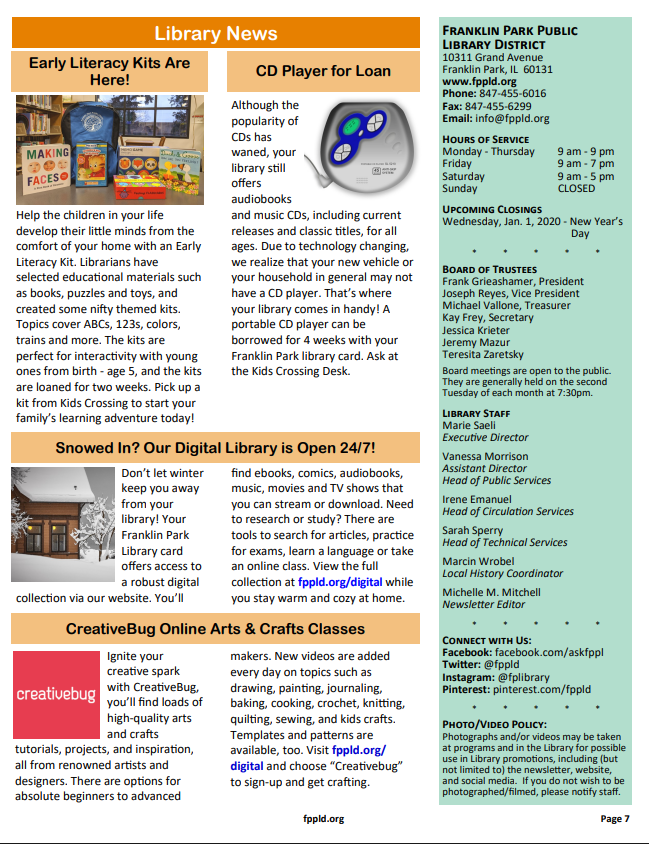
Bad information Architechture: Important information is buried at the end (News, upcoming closings, hours) while not-so-important articles (“Meet our librarians” article) is on the front page.
Content Quality: Many program articles blurbs are copy-and-pasted de4scriptions on the type of program instead of going into detail on the project/ activity planned for that specific day
Overall, these issues show that the newsletter is difficult to engage with and does not align with how people, especially a busy working-class community with a large immigrant population and a wide range of educational backgrounds, typically consume information.
With that in mind, I focused my redesign on making the newsletter more visual, easier to scan, and more engaging so that users actually want to read it.
Apply
The redesign
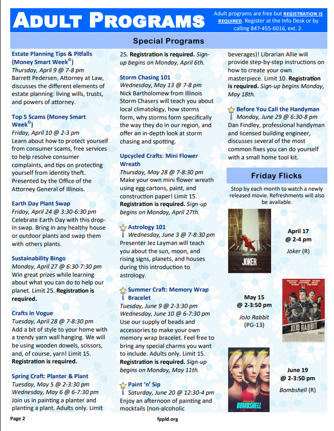
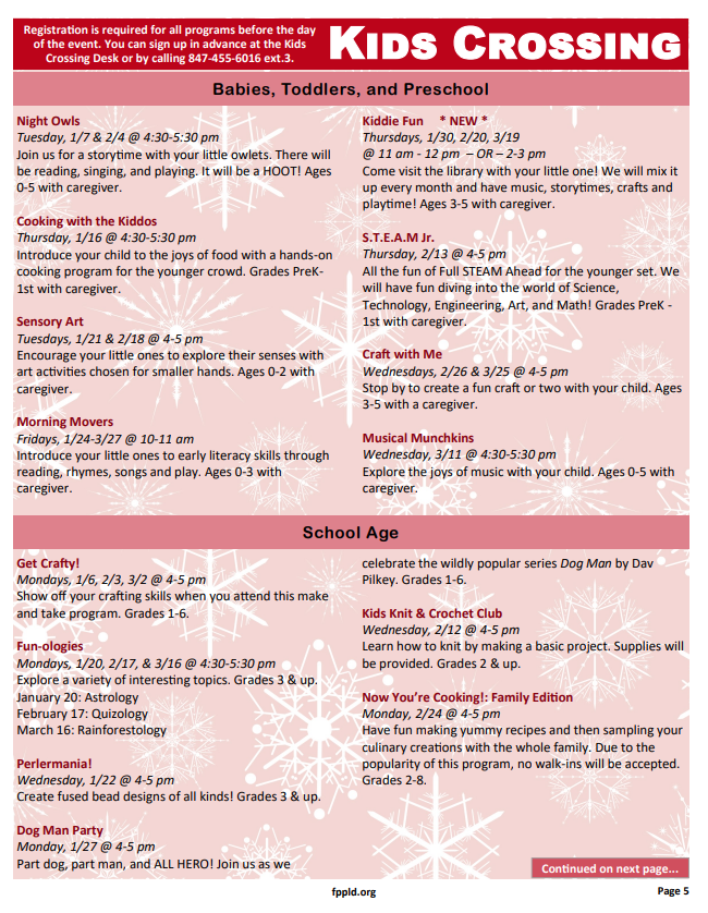
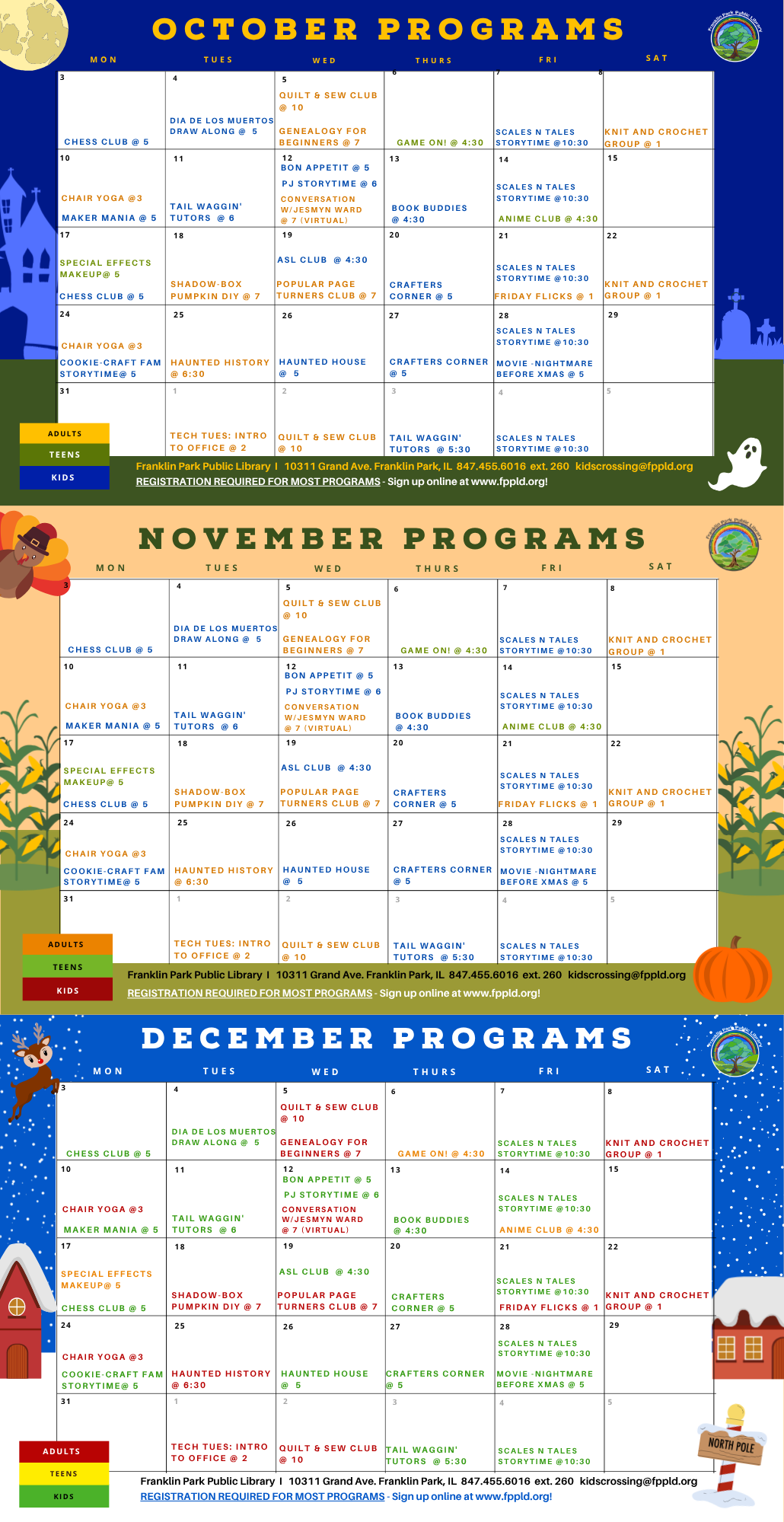
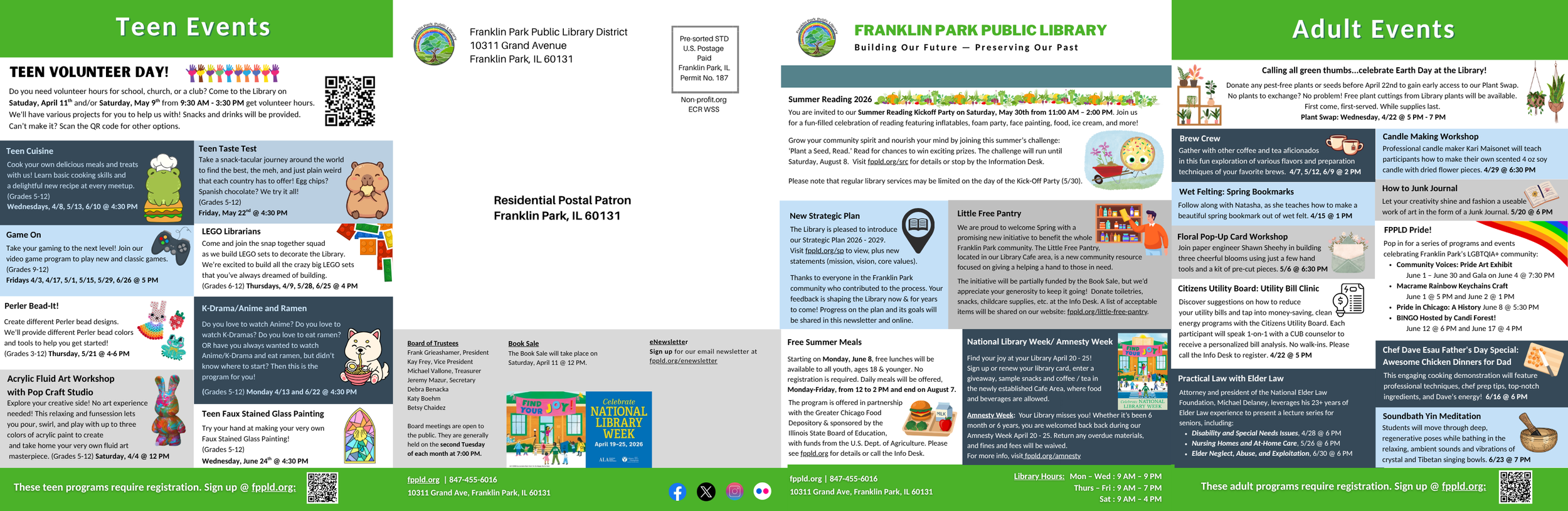
To address these issues, I redesigned the newsletter in Canva to be more visual, structured and easy to navigate. I used a calendar-inspired layout and color-coded program sections to improve scannability.
Important information such as news, hours, and key updates was moved to more prominent locations, while consistent footers ensured essential details were always accessible. I improved content quality by rewriting program descriptions to be more specific and experience-focused, put program dates in bold and added QR codes and clearer messaging around program registration to improve usability.
Overall, this redesign aimed to transform the newsletter from a dense, text-heavy document into a fun and user-friendly communication tool.
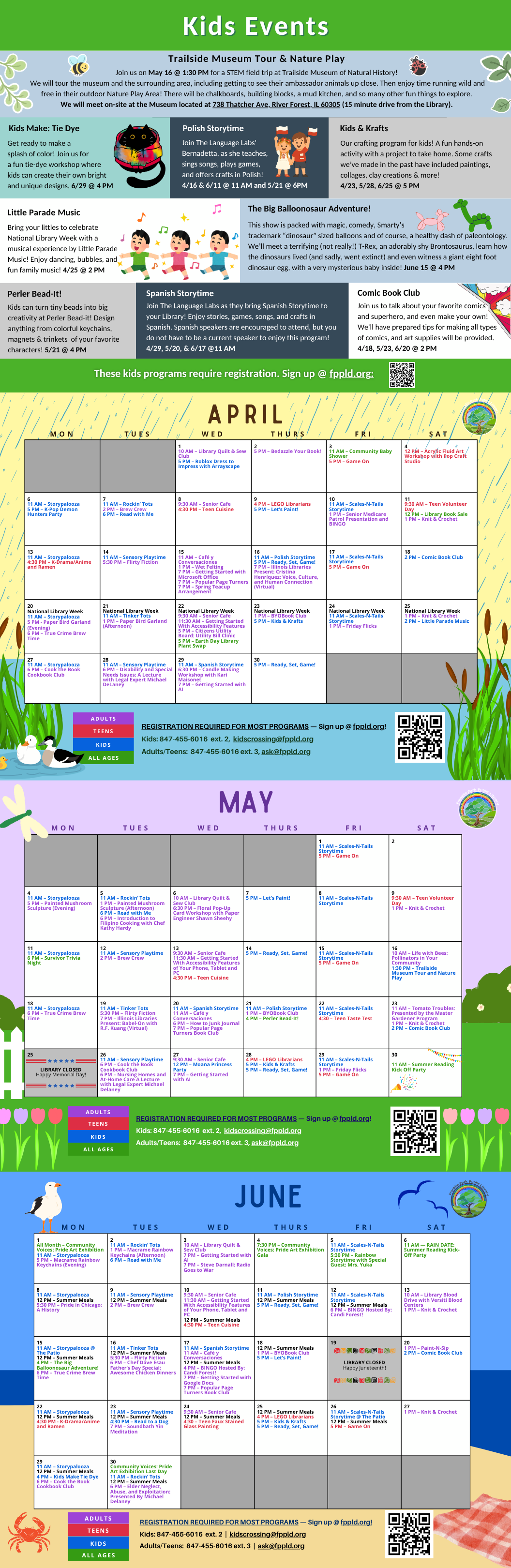

The newsletter felt fine for a bit but the design was changed again to be able to include more information. The 3-fold booklet became 4-fold. This gave enough space to have a news page, Adults program page, Teens program page and Kids program page instead of one page for featured events.
Feedback
Just like before, I asked staff, management and patrons what their thoughts (positive & negative) were on the new design. The replies were overwhelmingly positive.
Some of the comments:
“I started folding this over and putting the current month on my fridge! I’ve missed less events this way!
“I love the images!”
“The calendar makes it easy for me to find what I’m looking for”
“The text is a bit too small for my eyes", but I do like it”
“The QR code was a good idea”
“I love all the colors and pictures added”
“I’m a bit confused why the programs are not in chronological order”
“This looks like its for kids with all the pictures & colors”
“How fun! The other one kind of looked like a newspaper”
Some feedback highlighted areas for improvement. Users mentioned that the text was too small, programs were not in chronological order and that certain colors, such as orange and red, looked similar on the calendar. These issues were addressed in the second design.
Refine
Looking back, I regret not collecting more structured feedback (such as a public poll) to gather more concrete data on how the redesigned newsletter was received. However, based on conversations with patrons and staff alike, the overall response was extremely positive! Many people were pleasantly surprised by the changes and I noticed an increase in patrons browsing the newsletter casually, rather than only looking for specific information. Staff also began using the calendar section more frequently to reference program dates.
The newsletter was meant to highlight that these are free, community-funded services that can actually benefit people in real ways. It was also about fighting the idea that libraries are boring & just about books, because that’s really not the case anymore. Libraries are spaces for community and one of the few places left where people can just exist and spend time without feeling like they have to spend money. The ultimate goal of this project was to bring more people into the library by doing a better job of showing the value of its resources, and I think we did just that.
Given the positive reception and improved usability, the redesigned newsletter will remain in use with future changes made as needed.